

How to DIY a visual brand

Let me start by saying that I value designers. I’ve paid my fair share of designers over the years. I’ve even married to a designer.
This email is not meant to devalue a craft that brings so much strategy, intention, and beauty into the world.
What I’ve realized over the past few years (and this isn’t an original thought!) is that many creatives and businesses owners spend money on design too soon.
Some schools of thought will tell you to eschew design altogether in the early stages of your project. Sell from a Google doc! An email! It doesn’t need to be pretty!
That’s what you’ll hear from team Minimum Viable Product (MVP), and I can’t fully get down with that line of thinking.
I’m team Minimum Lovable Product (MLP). Create an initial offering that people can love.
And I, for one, love things that look good and are easy to use.
Which brings us to DIYing a visual brand.
I’ve chosen to DIY the branding for my projects, like this newsletter, and companies over the past couple of years. DIYing allows me to quickly and cost effectively work towards an MLP.
Once there’s traction, I can pay a designer to elevate what I’ve created or rebrand entirely.
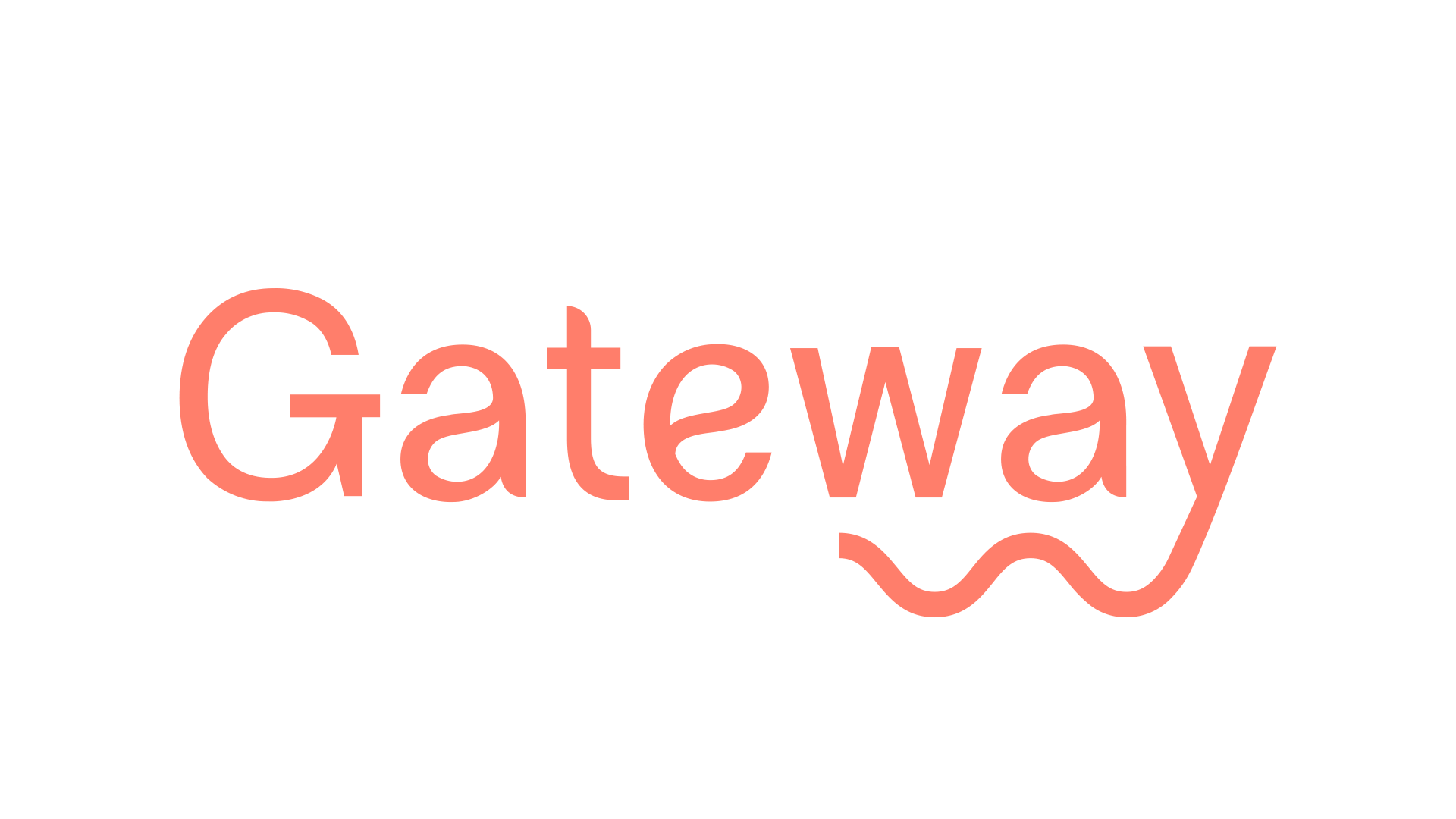
So let me walk you through the process of designing the branding for Gateway Coaching.
Side note: We’re running a giveaway where you could win three months of free coaching when you join the waitlist!!!
Wait, one more thing! There are affiliate links in this report. Using my affiliate link costs you nothing and makes this work more sustainable.
Step One: Vibe out
All of my design projects start with me thinking about the relationship I want the brand to have with the end user.
For Gateway Coaching, I wanted people to land on the website and feel like we were gender neutral, trustworthy, fun, and tech adjacent.
To me, that meant I’d be playing with color and hunting for a font with clean lines and a playful flourish.
Step Two: Find your logo font
For most non-designers, a type-based logo is going to be easier to DIY than an image-based logo.
You can find loads of free fonts at 1001fonts or FontSquirrel. If you’re building a visual brand for a business, make sure the font has a free for commercial use license.
My favorite place to find fonts is Creative Market. My husband and I are font aficionados who will call each other over to admire a design’s gorgeous font. That also means that we tire of seeing the same old, same old fonts in logos. The fonts you’ll find on Creative Market won’t be the same ones everyone else is using.
Wherever you choose to get your fonts, there should be a text box where you can type the name of your project. This will give you a sense of what the logo will look like.
It’s common for me to rapid test over 20 fonts before I decide on the one I want to go with.
I notice which styles I’m most drawn to. Serif? San serif? Hand lettered? Thicker? Thinner? Vintage? Minimalist? Then I use those characteristics as search terms.
Pro tip: Look for fonts that have alternates and glyphs. This will give you more letter options and ultimately give your design a more custom feel. Here’s a YouTube tutorial on how to use those characters in Adobe CC and Canva Pro.
Step Three: Choose your brand colors
Revisit your initial vibe check. What colors contribute to the vibe you’re going for? I knew there would be a blue in Gateway Coaching’s branding, since blue is often associated with trust. Then I brought in other primary colors to infuse playfulness.
My favorite tool for building color palettes is Coolors. They have a palette generator that feels like a slot machine. You press the spacebar, and it gives you a set of colors. You can hold on to any colors you like and then press the spacebar again. Eventually you’ll have your MLP palette.
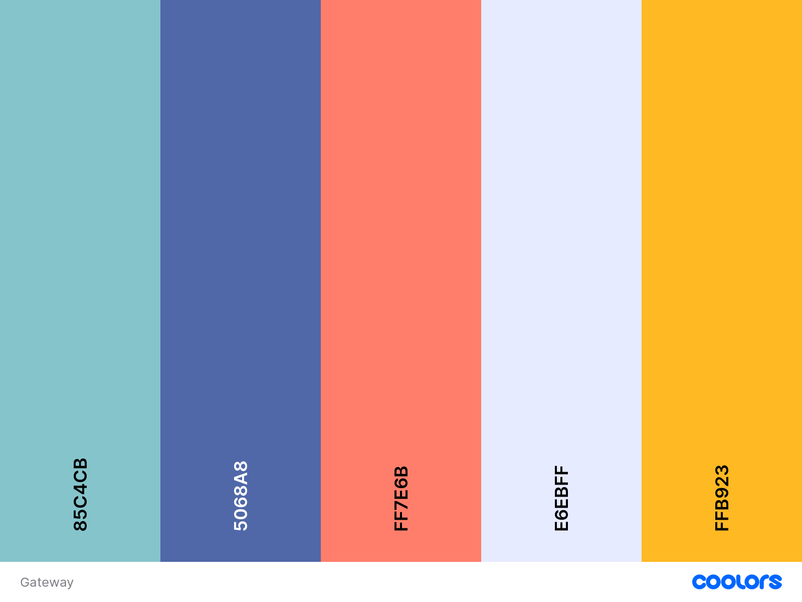
If a spacebar slot machine doesn’t feel fun to you, they also have a bunch of pre-generated palettes.
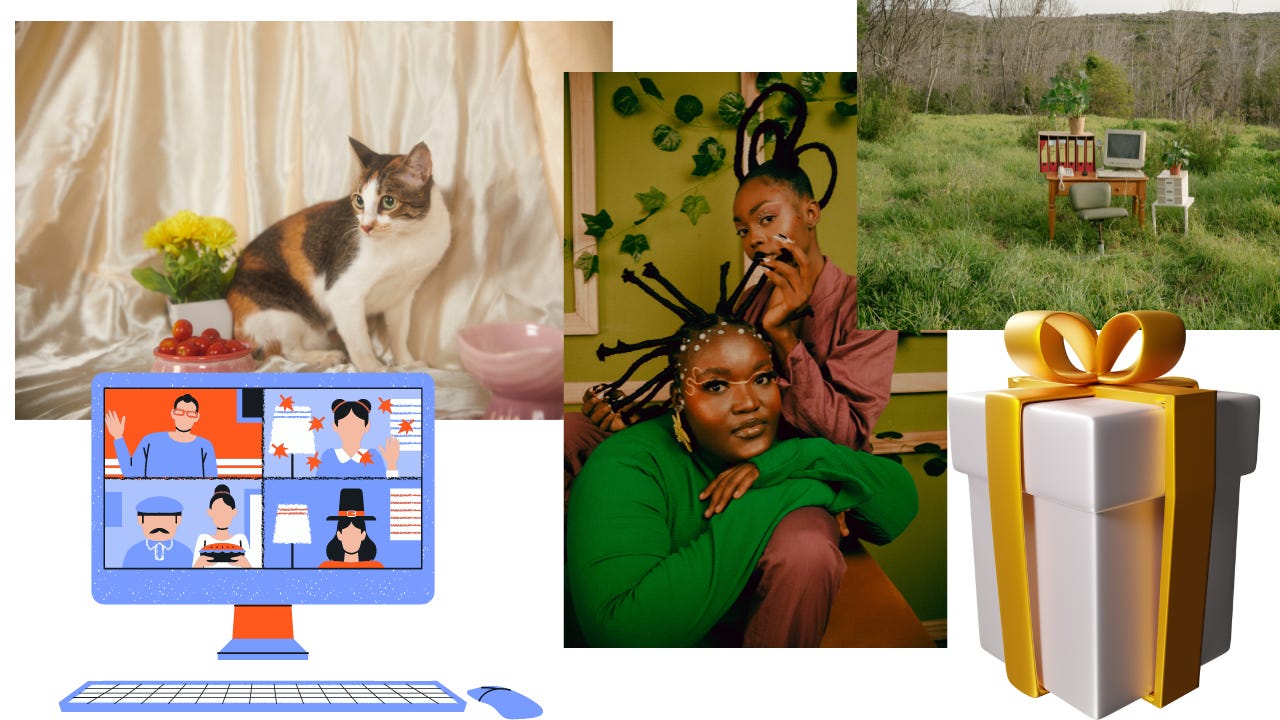
Step Four: Find your imagery
You need more than a logo and a few colors to create a visual brand. Most brands use imagery, too.
I’m painting with broad brushstrokes, but the three main directions you can go for imagery are: photos, 2D illustrations, and 3D illustrations.
There are plenty of places, both free and paid, that you can get this type of imagery. I’ll list some of my favorites below.
But first, I have to give a shout out to Canva Pro. The links to Canva in this report are affiliate links. I also use the Adobe Creative Suite, but I honestly couldn’t DIY a brand without Canva. I started using Canva pretty shortly after it came out and upgraded to Pro once I started collaborating with teammates on social and podcast graphics. You’ll often hear people say that Canva Pro makes staying on brand really easy, but an underrated feature is their stock library of photos, videos, and illustrations.
Also, I’ve found items I’ve purchased on Creative Market in Canva’s stock library.
Here are some other places to get content for your brand’s imagery:
2D + 3D illustration: DrawKit, Craftwork , and Creative Market
Step Five: Choose your fonts
The fonts that you use on your website and in print are typically not going to be the same as the font in your logo.
Designers pair fonts that bring their desired vibe to life. There’s an art and science to font pairing. I have a lot of fun with pairing fonts. Canva has a free guide if you want to try your hand at it.
If you prefer a little guidance in font pairing, check out FontPair and FontJoy.
Step Six: Bring it all together
When you work with a designer, one of their key deliverables is a brand style guide. If you use Canva Pro, this is the template I use to build mine.
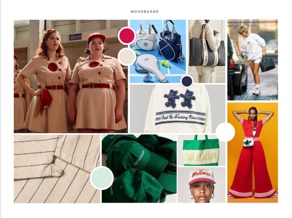
You can easily build your own style guide. The key elements you want are your logo, submark (if you have one), fonts, and colors. I like this template because it also has room for a moodboard. I actually didn’t do a visual moodboard for Gateway Coaching, so I’m including one from another upcoming project below it.
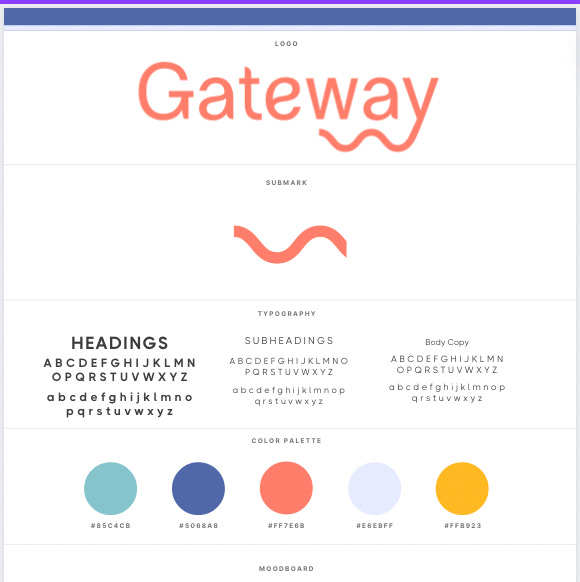
Another reason I use Canva Pro is because I can upload all of my brand assets into Canva and then it helps me customize their templates to my brand standards. I made a bazillion Pinterest covers in a matter of minutes by pressing a few buttons.
So there you have it! That’s how I DIY a visual brand.
I’m always mindful of how much time I spend on this process. The goal is to build a Minimum Lovable Product, but I can do the most if left unchecked. My advice is to make this a Friday or a weekend activity with a time cap.
I’m adding in a poll for next week’s report. You can also leave a comment if there’s a process you want to see me break down!
LOVE that you brought this back via Threads for all of us to benefit from—you're the best.
This is really helpful. I can see myself coming back to this guide in the future for design help!